Thursday 26 September 2019

Ideologies of the Tide Print Advert


Tide Print Advert - Ideologies


What is the ideological signification of the choice of focal image in this advert?

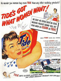
The focal image is the woman hugging the box of Tide, this choice was made because the advert believes the ideology of women is that they too, will love the product.

What can we tell about the producer's ideals and values from this advert?

The producer's ideals and values from this advert is women to do the cleaning in the household, and be a housewife, because of all the action codes used of women doing household chores. The producer believes in gender roles and that is their value.

Apply structuralism and the theory of binary opposites to the Tide advert.

The theory of binary opposites according to Strauss is that the world is seen as something by being described as something it is not.The theory of binary opposites in this advert is structured in a way that it's aimed at women and not men because there are no men just women featured on the advert. The focal image features the woman hugging the box, she doesn't hate the product because if she did she wouldn't be hugging the box to show admiration towards it

Wednesday 25 September 2019

Tide Print Advert - Media Set Product 1


Tide Print Advert (1950s)


Procter and Gamble


They are an American company who own many multinational goods such as toiletries and detergents they have been running since 1800s and own Tide and other famous brands such as Gillette.


What life was like for women in the 1950s?


In the 1950s, gender roles were important at that time, women had to clean and take care of the children (housewife) while men were at work earning an income for the family. As it was post-war, there was more disposable income with new technological innovation and advertisement on radio and magazines were popular amongst women, therefore most of the advertisement were aimed at women. 


Can you find any similar 1950s adverts what do they have in common?


All adverts in the 1950s also followed the stereotypes of men and women, the housewife would clean and be caring and that's what she enjoys while the husband is out at work or relaxing at home after a long day with his wife taking care of him. The wife is usually wearing a dress and the husband is wearing a suit to signify importance, both conforming to the gender norms in the 50s. The ideology of the 'perfect household'.


Who are D'Arcy Masius Benton and Bowles? What are they famous for?


They are an American advertising company, one of the largest in the world. The company is iconic for creating Coca-Cola Christmas, Skittles, M&Ms and Budweiser adverts which are remembered.
  • The audience had a high level of confidence in the company because it was it was a large well-known company and had already been running for over a hundred years, this made them have a lot of power. 
  • They didn't just use print advert they also used radio advertisement because when housewives are cleaning the house they listened to the radio at the same time as they were at home all day.
  • The purpose of the advert is to make housewives to buy the product. 


Mode of address


  • The direct address 'No wonder you women', women are being specifically targeted, and 'you' directed at the audience.
  • Lexis used is the tagline that is aimed at women, 'Tide has got what women want', which is anchored with the image below. An enigma code, the audience want to know what Tide has got that women want.
  • Everyone is using it why aren't you? The tone and lifestyle created is aspirational 'more tide goes into American homes'.


Textual Analysis


  • The word 'clean' is highlighted in red and is in bold such as tide, the background colour is white with connotations of cleanliness. Women don't want a husband and their children to be dirty- this could link to the American dream. 
  • Action codes- The woman is hugging the box, which means she loves the product. There are two women hanging the washing up, boasting about Tide and picturing what the ideal women look like. There is a washing machine whilst the woman is holding up a sign saying what makes the product special. Most of these activities that women can relate to.
  • The perfect housewife - role model for women- perfectionism - ideology. She must be using Tide, wearing makeup, wear heels and nice clothes.
  • The colours used include bright red capitalised letters with an exclamation mark, it is the first thing you see of the advert because the Z-line draws audience in. The colour white connotes innocence and purity.
  • It is detailed because it makes the audience convinced with all the information that has been given. 
  • 'Guaranteed by Good Housekeeping', it is a magazine, women will most likely read this magazine and trust the them, it is given a stamp of approval. 
  • The advert is illustrated, common for many adverts at this time.
  • The advert includes a z-line layout, first seeing, 'Tide's got what women want!' leading to the audience wanting to see what the statement can be proved, you then see what makes the product so great, the you see a woman hugging the Tide box and more information about it with a statement that the audience should 'Remember!'.


Monday 23 September 2019

Textual Analysis of Print Advert


Textual Analysis of Print Advert  


  • The advert includes a z-line, the audience will first see the woman and then the man to the text and brand name.
  • The typography used is a sans-serif font, 'objects of desire', the 'objects' being referred to are the perfumes that would make you appear more 'desirable' because of your scent or perhaps the woman sees the man as the 'object' or the man sees the woman as an 'object' for their desires. The use of lexis may make the audience feel engaged as find out what the perfume does to make them too, desirable.
  • The rule of thirds includes the section of the model's faces, the two holding the bottles and text and lastly the perfume bottles and brand name. 
  • Both z-line and rule of thirds help the image and text create anchorage by looking down onto each different part of the advert.
  • The brand's logo is at the bottom left, next to the perfume bottles to make the audience aware of the name and what the bottles look like.
  • The woman is wearing a red dress and the man is wearing a brown shirt, matches with the perfume bottles. 
  • The red dress and the colour of red may connote romance and love as well as desire, she purposefully stands out however the man is wearing brown which matches with the surroundings. This may conform to John Berger's theory in, 'Ways of seeing' 1972, the woman purposefully stands out because women appear and men act, the woman stands out because she isn't a man.
  • Mode of address that is being used is the text in the middle of the advert which persuades the audience to buy the product.

Friday 20 September 2019

Roland Barthes’ Semiotic Theory


Roland Barthes' Semiotic Theory


Codes- Symbols that have to be entered to unlock something.

Codes in Media- Visual, written and symbolic tools used to create meaning.

Enigma/ Hermeneutic Codes- A mysterious part of a media text which engages the audience making them wanting to find out more.

Action/ Proairetic Codes- Elements of a media product that may suggest an action may happen.

Symbolic Codes- Symbols are something which the image or something may represent.

Semantic Codes- Parts of the media product in which have a hidden meaning that the audience may easily understand.

Cultural/ Referential Codes- Parts of a media product which only certain audiences will understand who are part of a particular culture.

Analysing Print Advert


Analysing Print Advert


  • The colours used such as pinks and reds are stereo-typically associated with femininity and can also connote romance.
  • The brands name is small and in the bottom corner as the name is less important than what they are trying to sell. They are showing the items that the audience can buy however they aren't as clear perhaps, also trying to sell a fancy and luxurious lifestyle as it is a designer brand.
  • The use of flowers in the garden matches with the model's outfit and also the use of the colour green, looks nature-like, the season that's being represented could be spring, a spring-time outfit.
  • The typography used is a serif font, making it appear formal and sophisticated.
  • Direct address, the model is centred and making direct eye contact, shows confidence and used to entice the audience.
  • You can tell that the model is wearing make-up and wearing typical feminine clothing, conforming to the stereotype of women.
  • There is no slogan or tagline on the advert because what they're advertising is much more important.
  • The advert includes anchorage, you first see the model's face and then you see the items and then the logo at the bottom.
  • The gloves connote sophistication and is old-fashioned. 
  • There is a website very small at the top left but might not be important as people who can buy the brand Coach might already perhaps know where to buy it.
  • The lighting used is subtle and light, making it appear soft and delicate.
  • She is holding the bag in front of her so the audience can get a glimpse of the items.


Monday 16 September 2019

Suspense sequence video


Suspense sequence

For this suspense sequence, me and my group named this piece, 'The Ascend'. This character walks up the stairs fearing of something, this suspense was created through the use of various camera angles.    


We first used a storyboard to plan out how we wanted the video to look, we then filmed the shots using a camera; firstly, we learnt about how to use the camera. I enjoyed this because I have never used a DSLR and was interested in how it works. After that, I placed the video clips onto the computer. To edit these clips, I used a software called Adobe Premiere Pro, I was unfamiliar with the programme, so I learnt how to select and cut clips, how to add text, use colouring and export. My experience on using the programme was good and I enjoyed experimenting with the range of filters and I hope that my skills on the software will improve over time.              

Monday 9 September 2019

Suspense sequence


Suspense sequence 

-Someone walking up the stairs.

3 empty shots
2 low angle shots
2 high angle shots
3 extreme close-up shots

Empty shot- Nothing in the scene, just the setting.

Low angle shot- The shot films the character from below.

High angle shot- The shot films the character from above.

Extreme close-up- The close-up shot is zoomed into the object or character to only show one feature of it.


The person walks up the stairs from a high angle shot, with flashes in between to show an empty shot of the stairs. And high angle shots from the bottom of the stairs and low angle shots from the top of the stairs, there will be extreme close-ups of the person's eyes, feet and stairs. The sounds used will be diegetic of the person stomping their feet down the stairs or no sounds.

Top 5 TV Shows


1. Brooklyn Nine-Nine

2. The Good Place

3. Detroiters

4. Corporate

5. The Goldbergs
My Top 5 TV Shows